Guppy Mobile Application for Pet Owners
A Case Study in UX Design
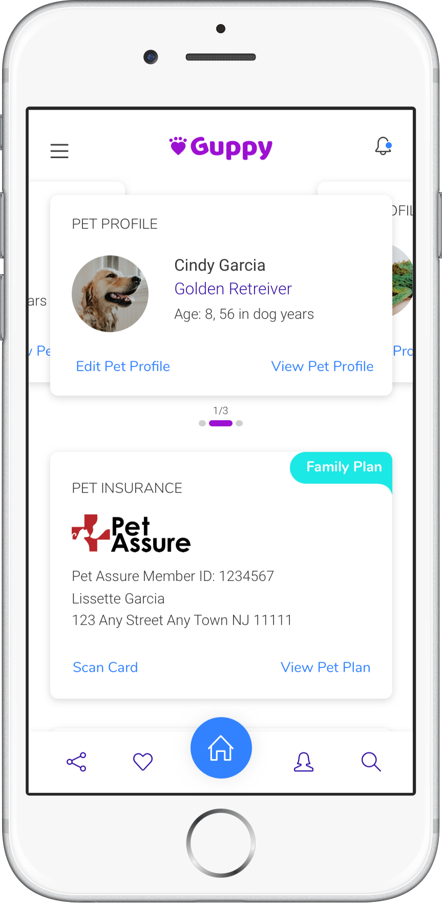
Guppy is a mobile application where you can track your pet's vaccinations, pet insurance, insurance benefits, vets, pet friendly places, and view reviews from your vets, so you can give the best services to your pets.
RESEARCH PLAN
To ensure my application was something people would choose to use for their pets, I began with user research. This included a screener survey and interviews collecting information of what users would want to see and use in a pet app.
Here are some questions I asked a group of target users:
How often do you go to the vet to check your pet's health within the year?
Would it be helpful to track your pet's vaccinations on your phone?
Would it be helpful to get discounts, special events and pet supply info from your nearest pet store?
The results of my research revealed that many people only take their pets to the vet once or twice within a year. Not many would take their pets three or four times a year. I also found that all individuals would like to track their pet vaccinations on their phone. Almost half of the individuals wanted to receive discounts, events and pet supply info for their local pet stores. Overall, receiving the extra support from a mobile app would be helpful to all individuals that participated in my research.
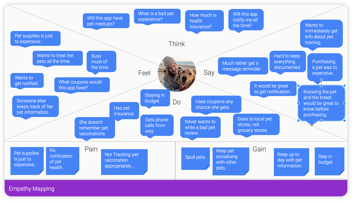
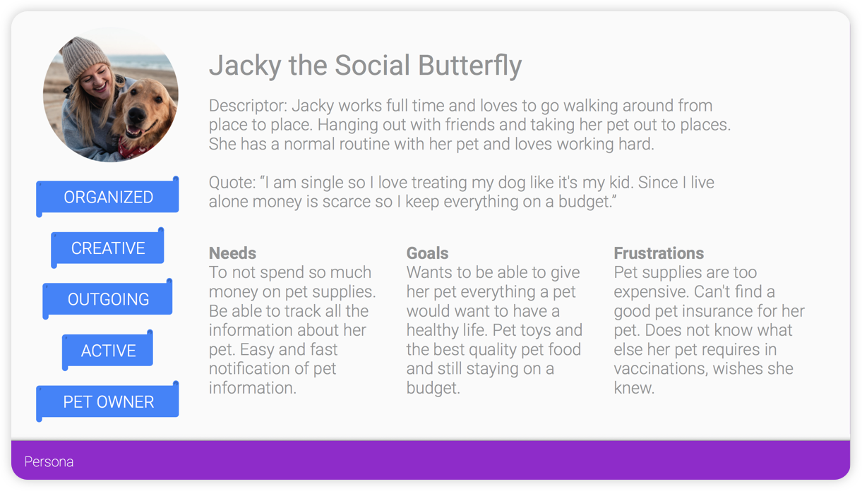
Empathy MAp
After completing the user research, I moved onto empathy mapping and personas. First I created my empathy maps which informed the personas I developed. My personas represented unique target audiences revealed by my research.
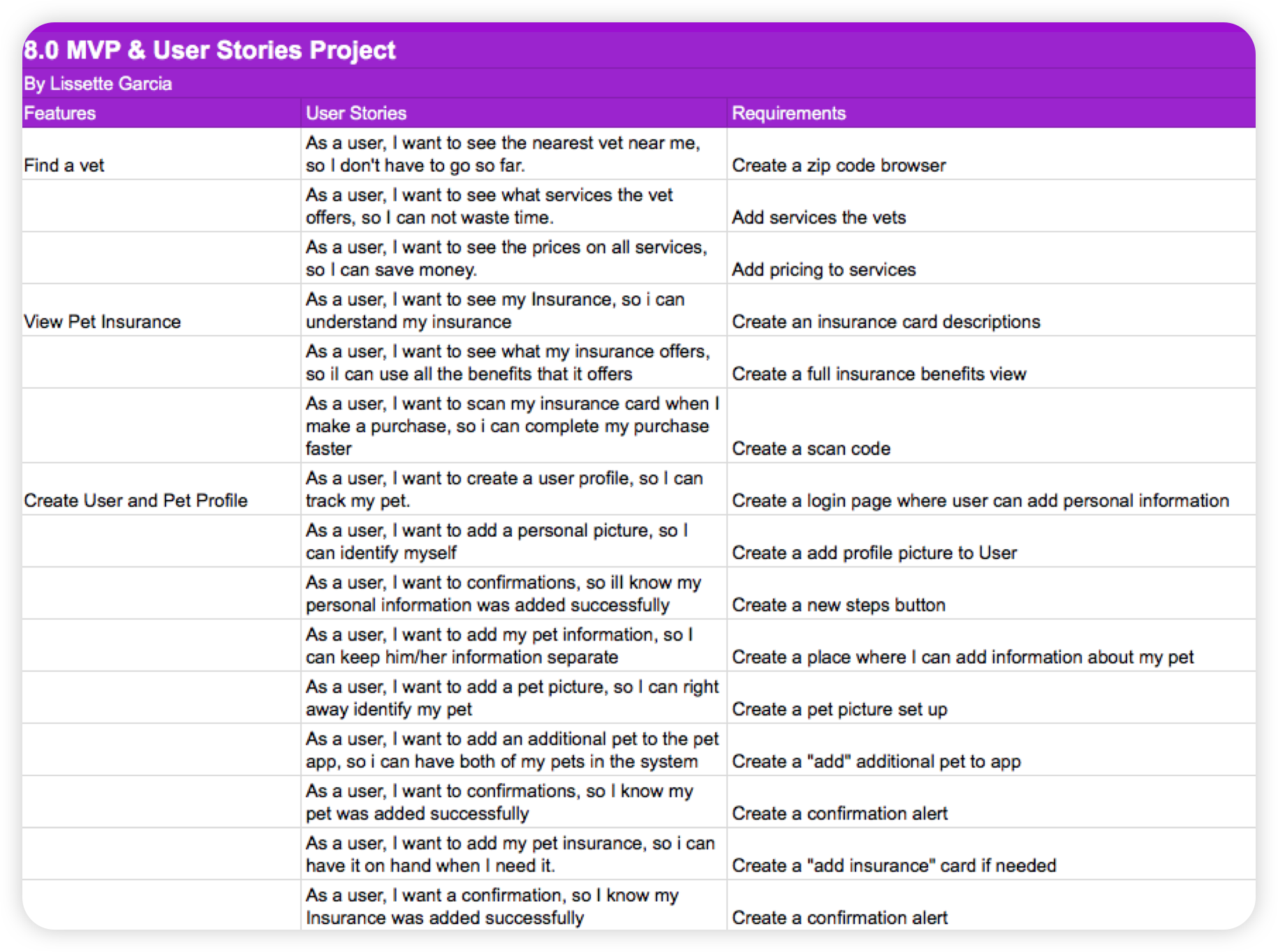
User Stories & MVP
By using my research and personas, I developed user stories for the three key features users would want to perform. This helped me define my MVP (minimum viable product), which consists of these features:
Find a vet
View pet insurance
Create User Profile and Pet Profile
Below is a small sampling of my user stories:
View pet insurance
Create User Profile and Pet Profile
Below is a small sampling of my user stories:
Card Sorting
With MVP features defined and the user stories completed, I was able to jump into card sorting. I added all features and questions of the MVP to the cards so card sorting participants could categorize them.
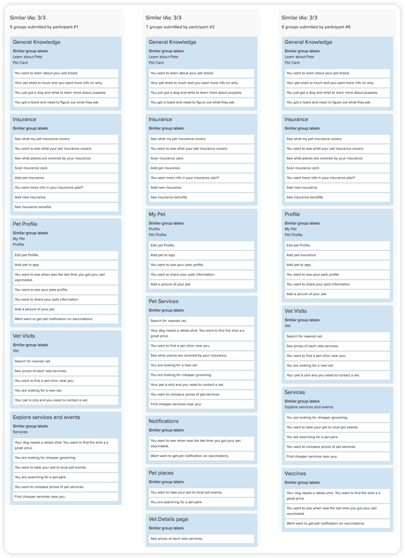
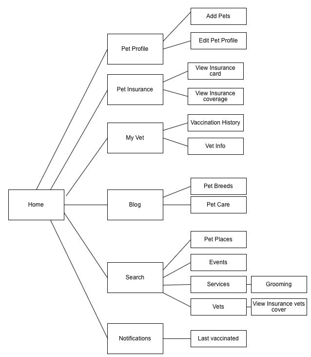
Site Map
All the data that came from the card sorting resulted in the top navigation in this sitemap. Below is an image of all the top navigation pulled from the card sorting.
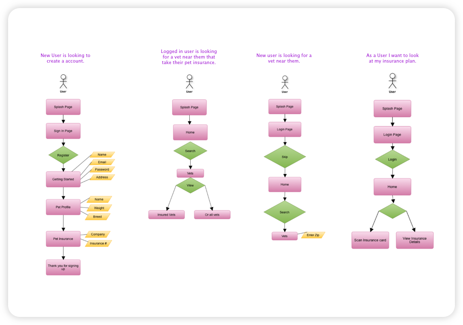
User Flow
Once my sitemap was complete, I was able to build out user flows. I put myself in my users' shoes to create four user flows, also keeping in mind my MVP and card sorting results.
Wire Framing
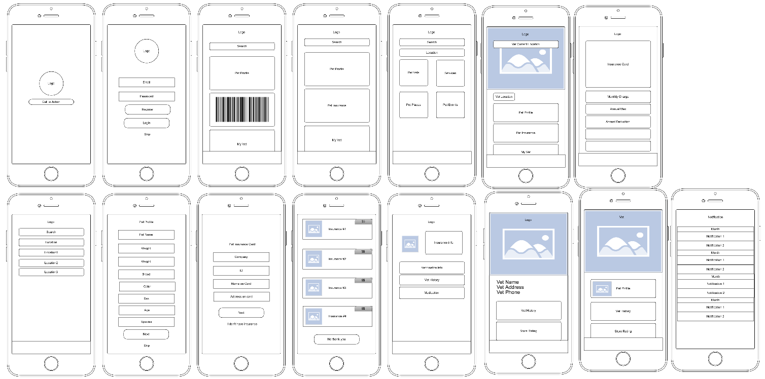
After creating my user flows I started wireframing the app. In this stage, I started thinking about the interface and my users. Before I began putting my wireframes into Figma I first started sketching what these screens would look like. I then created a clickable prototype with these wireframes. This low fidelity prototype would also be used for the research evaluation. Testing each screen provided insights as to what worked and what didn't work.
Style Guide
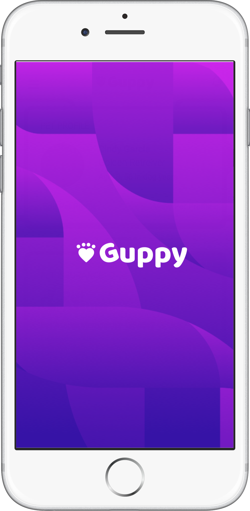
After creating the low fidelity prototype I starting thinking about the brand and style of the app. First, it began with thinking about the name of the app. I wanted it to feel inclusive of all types of pets. Guppy is a name of a fish, all animals came from the water and once were fish.
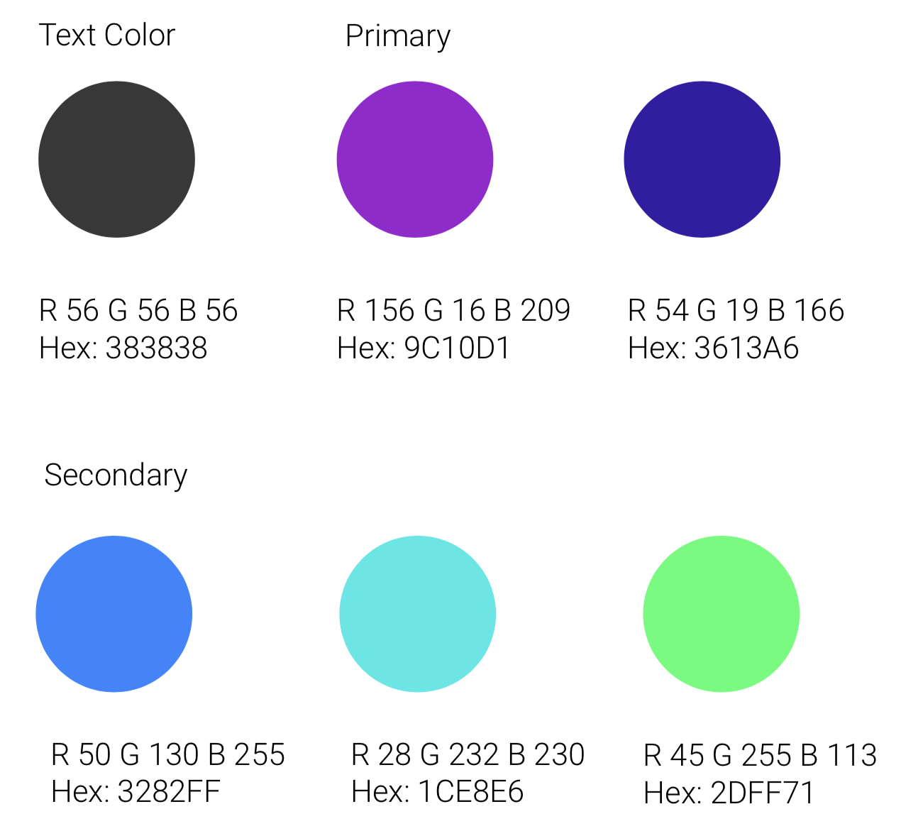
From here I started looking into colors. I picked an analogous color palette because I wanted to use cool colors to give it that fresh look and feel. I also wanted to use these bright colors lightly around the app.
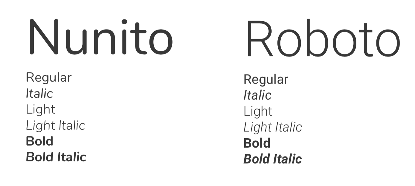
With fonts, I wanted a very clean, simple and bubbly font for paragraphs to enhance readability. I decided to go with google fonts, Nunito and Roboto.
Visual treatment
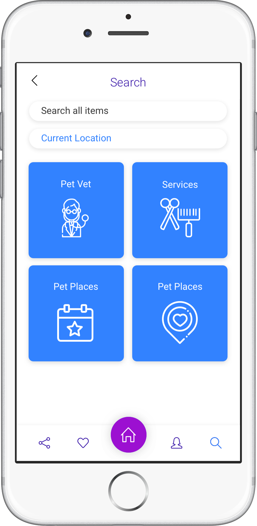
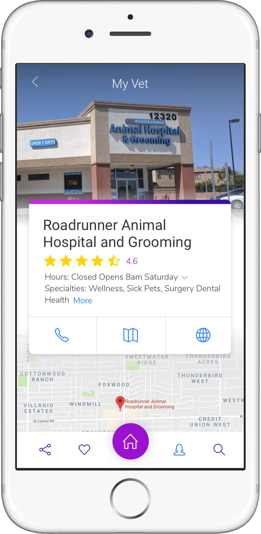
After creating the low fidelity prototype and the brand guide I began creating the user interface. Here are four screens of some of the interface.
Research Evaluation
By using the low fidelity prototype, I did some more testing on the app. Here are some of the questions I asked my users.
Registering for Guppy
Question type: Expectations
Start Screen: Splash Page
Question(s):
Without clicking on anything where would you expect to start registering your pet?
How many steps would you expect to take before landing on the Dashboard?
Searching for a vet near them
Question type: First Impression
Starting Screen: Search
Question(s):Without clicking on anything.
What do you notice on the screen?
Is there anything you feel is missing from this screen?
Tell me three things that stand out the most?
Looking at their pet insurance
Question type: Performance task
Starting Screen: Splash Page
Question(s): By first entering the app and loging in, how can you find your pet insurance?
Score: 0 1 2
They knew where they were going and where everything was located as I talked and asked questions. Did get some feedback about adding back buttons and adding a home button everytime I am not home. Some of the users wanted to see more on the screens as in more of the elements that will be in the insurance card and what information will be in the dashboard compared to the Insurance page. One confusion was also the comparison between the insurance history and vet history. I think giving more details about those would of help remove all those questions.
I tested three users that come from different ages and family backgrounds, ages 25 - 60. Some users were not as tech savvy as others but they understood the mobile app and its purpose. One of the users wanted to see the app on an Ipad so he can see it a little better. I conducted all interviews at their homes so they can feel comfortable being interviewed. Some of the feedback I can focus on the most is making sure the typography is big so all users of all ages can use it. Adding a home page to the footer so everyone can easily go home. More detail on the insurance cards and something to let them know that there is more information in the card.
Conclusion
After finishing the research evaluation, I do feel there are endless possibilities I can do with this app. I do feel like it needs more user testing on certain areas and some more mockups created to be ready for launch. Going forward, I will be completing more of the UI from the low fidelity prototype.
LINK TO PROTOTYPE
LINK TO PROTOTYPE
